The biggest challenge in renovating this apartment was keeping the existing layout and the Xue Jin Architecture Network kept it as the owners wanted. Customers wanted the apartment to be more comfortable, spacious and brighter, and they wanted the kitchen and bathroom to be moved. They wanted ventilation throughout the home to be improved.
To meet these requirements, the architects opened up the rooms by removing any partitions that were not load-bearing walls. They created a seamless transition between the entrance area, the living room, the kitchen and the dining area. There is also now a large circular hole cut in the wall that separates the living area from the balcony, which is a pretty cool design feature and lets in more light.
In the living area, a custom-made wall unit combines various elements such as a sofa, a desk and a storage cabinet. It’s a hybrid piece that allows this space to be flexible and serve multiple purposes. It was made to relieve the room and make it look more spacious. The balcony and the dining area are also peculiar rooms that allow a lot of naturalness into the apartment through the large windows, but also look and feel very cozy.
The sleeping area is also a little unusual. Instead of creating two separate but very small bedrooms, the architects designed this large wooden platform with two beds and plenty of storage space underneath. The new bathroom has been moved to the previous location of the kitchen and has a bathtub embedded in a platform with a cozy built-in seating area.
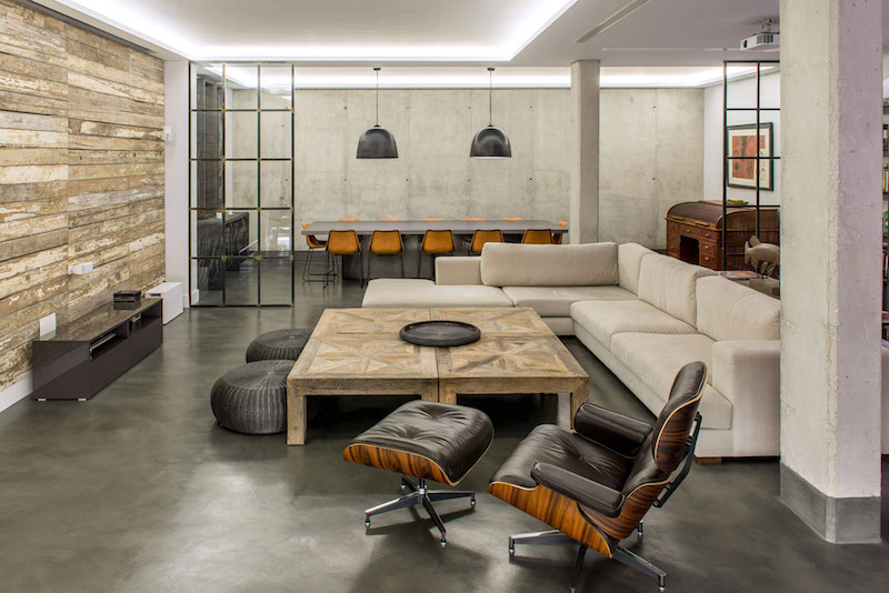
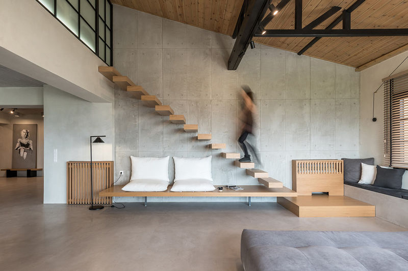
The decor is very minimalist, with some wood elements for a warm feel and raw concrete that gives the rooms industrial and structural lines.
 home decor trends
