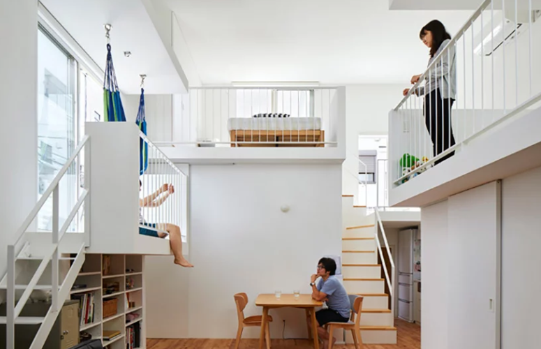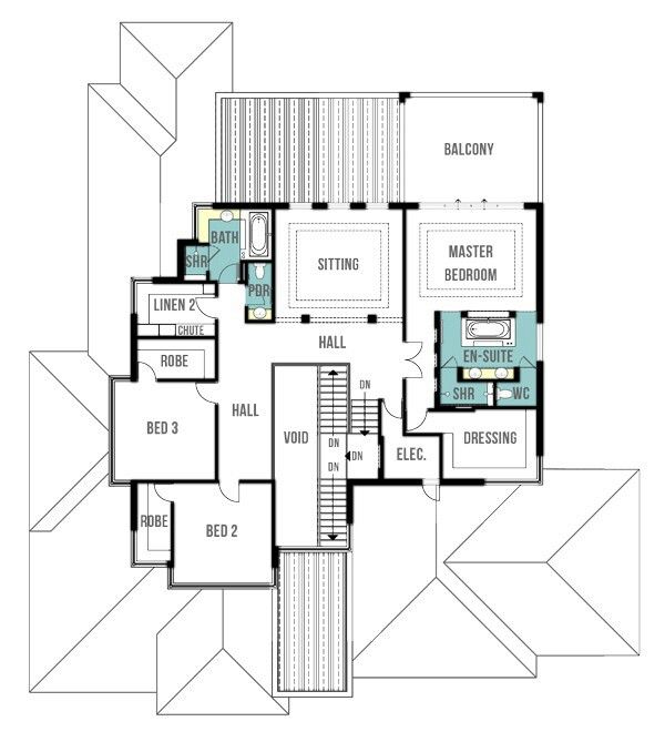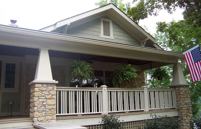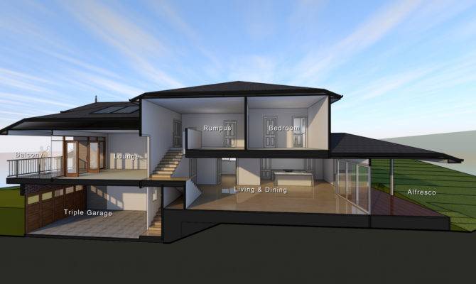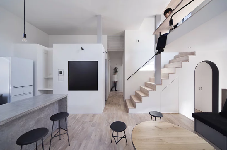
Zeze Osaka is a fine example of minimalist Japanese architecture and design. The Japanese design studio Swing wanted to build a house that could be a festive place in everyday life, in which the “ordinary and extraordinary” fit into this space with “individual and common” features.
First, the architects made sure that an appropriate height was maintained for each room by considering the balance between having suitable space for the bedrooms and an open feeling for the shared living room. A look through the mezzanine floor at the “borrowed landscape” of trees lining the street from the window ensures a place with an open feeling in the high density city.
I love the sub-levels and half-levels in the architecture of the house, where the floor becomes the ceiling and so on – it’s a hot trend in Japanese architecture that allows the ceilings to be kept higher and the rooms closed with it thanks to lots of windows fill over.
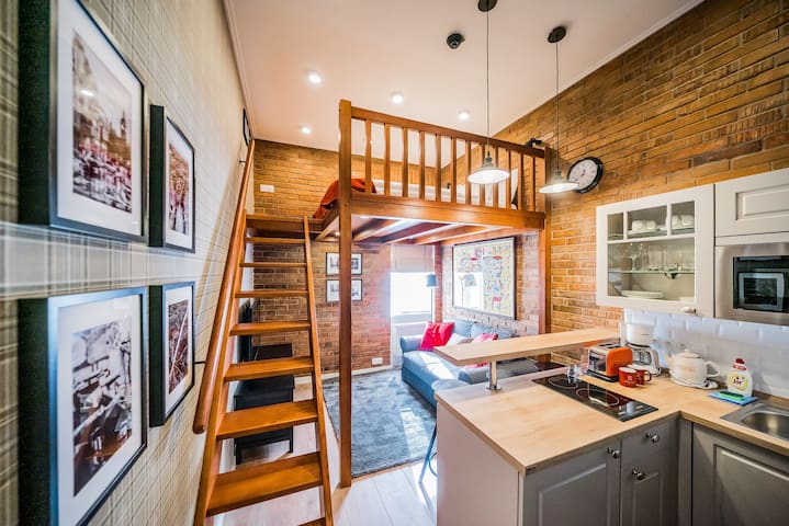
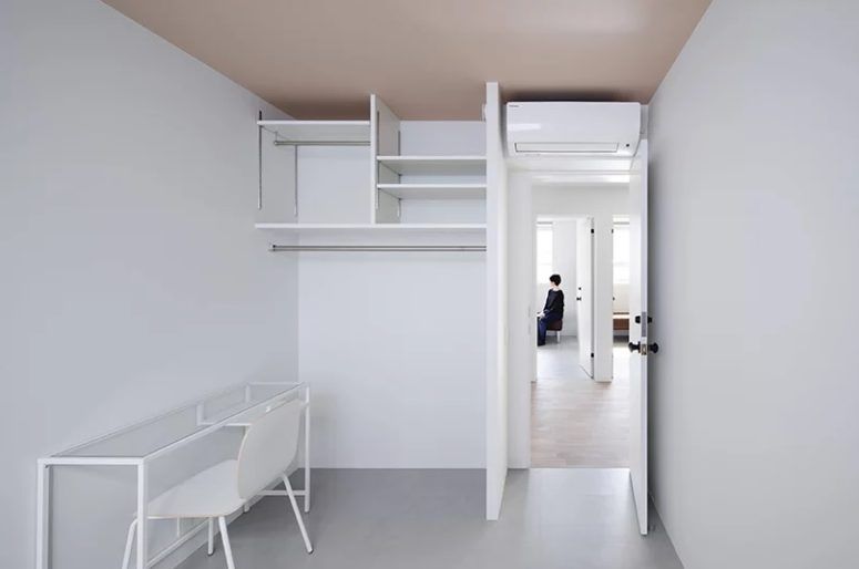
Inside, the house is decorated with light-colored plywood, concrete, and metal, and there is a visible brick backsplash in the kitchen. The color palette is restrained: white, gray, light wood and some black accents to add contrast and depth to the rooms. There isn’t a lot of furniture so as not to clutter the space and everything is minimalist, with a minimum of details and comfortable upholstery. The lamps are the most minimalistic and hang here and there.
 home decor trends
